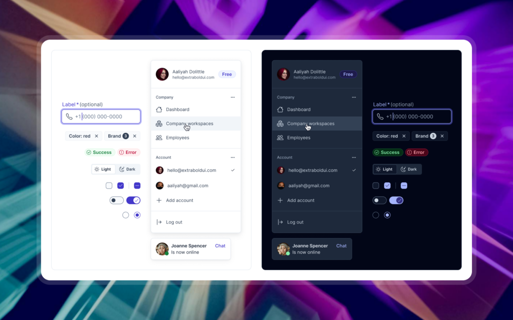
A design system is a comprehensive framework that ensures consistency and efficiency in product design and development. It comprises several key components, each playing a vital role in creating cohesive and scalable digital products. Let’s delve into these core elements:
Style Guide
The style guide serves as the visual foundation of the design system, detailing:
-
Color Palette: Defines primary, secondary, and accent colors to be used consistently across the product.
-
Typography: Specifies font families, sizes, and styles for various text elements.
-
Iconography: Provides a library of icons along with guidelines for their appropriate usage.
-
Spacing and Layout: Establishes rules for consistent spacing and alignment throughout the interface.
These guidelines ensure a unified visual language across all aspects of the product.
Component Library
This library comprises reusable UI elements that can be assembled to create diverse interfaces. Key components include:
-
Buttons
-
Form Elements: Input fields, checkboxes, radio buttons, etc.
-
Navigation Menus
-
Cards
-
Modals
Each component is thoroughly documented, detailing its purpose, variations, and usage guidelines to facilitate consistent implementation.
Design Patterns
Design patterns offer standardized solutions to common UI challenges, promoting a consistent user experience. Examples include:
-
Navigation Structures
-
Search Functionality
-
Data Visualization Techniques
-
Responsive Layouts
Documenting these patterns ensures adherence to best practices when addressing similar design problems.
Design Tokens
Design tokens are the fundamental units representing design decisions, such as:
-
Color Values
-
Typography Scales
-
Spacing Units
-
Animation Durations
Stored in a format accessible to both design tools and code, tokens enable seamless collaboration between designers and developers.
Documentation
Comprehensive documentation is crucial for the effective utilization and maintenance of the design system. It should encompass:
-
Usage Guidelines: Instructions for components and patterns.
-
Best Practices: Recommendations for implementation.
-
Examples and Code Snippets: Practical illustrations to guide users.
-
Version History and Changelog: Records of updates and modifications.
Well-maintained documentation ensures all team members can effectively use and contribute to the design system.
Governance and Maintenance
Ongoing governance and maintenance are essential for the design system’s success. This involves:
-
Update Processes: Procedures for evolving the system.
-
Contribution Guidelines: Criteria for adding new components or patterns.
-
Version Control and Release Management
-
Regular Audits: Ensuring consistency and relevance.
By understanding and implementing these core components, organizations can establish a robust design system that enhances consistency, efficiency, and scalability in their product development endeavors.

